A Table
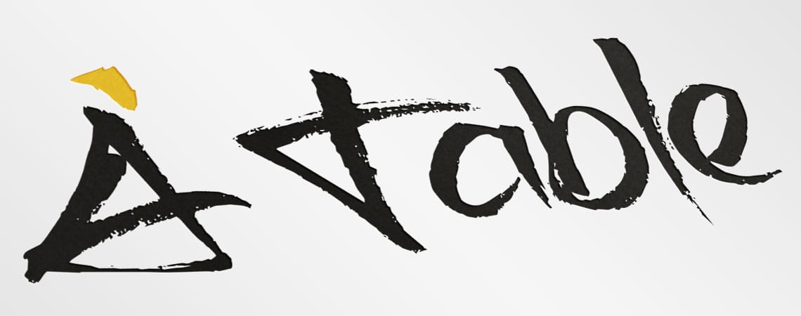
The inspiration for her name (A Table) comes from the French language. It means ‘Food is served/at your service’. It was on her shortlist of names and we really liked it because it conjured up the best things about French cuisine and coffee culture. It’s nostalgic and romantic, great traits for a café.
Before designing the logo, we did a lot of research into café trends in North America, continental Europe and Dublin city so as to educate ourselves and put us in the right headspace. This stage of the project is crucial. You have to immerse yourself in the client’s world before you can design an appropriate solution.
The font we chose is called ‘Brush Tip’. It’s a loose, hand-drawn font – quirky, but simple, and extremely effective. The predominant colour is a deep yellow which is very warm and inviting. The overall look is one of style and vibrancy.
In the client's own words
Not only did Passion deliver a carefully thought and well researched logo and brand story, my expectations were far exceeded. After a relatively short phone conversation, they understood our business, strategy, the direction we wanted to take and produced a unique logo to differentiate us from our competitors and fit with the business objectives.
Ailish Neilon, À Table


