Oilfield Solutions
First things first, we gathered all the key stakeholders, including their senior directors and top managers, for an in-depth brainstorming session, during which we asked them some fundamental questions about their business in an attempt to figure out what exactly made them unique or special.
It’s what we call a brand strategy review and the objective is to strip away the layers of corporate speak and get to the essence of a business or brand. By encouraging discussion, generating ideas and gaining consensus, a brand strategy review is the best place to start on any project, especially one such as this where new thinking is required. The participants really enjoyed it and found our creative approach very different. You could see afterwards that they were much more focused and really charged up.
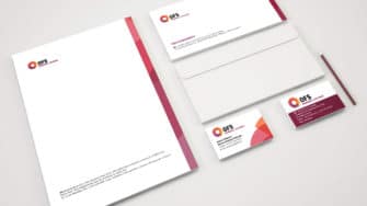
The next step was to re-design their logo. By their own admission, the old logo was a bit tired and washed out. It didn’t capture the energy and vibrancy of their industry or convey any feelings of positivity or dynamism. The new one is a significant improvement, we think you’ll agree.
The circular image represents a gas turbine when fired up and rotating at full speed. The tagline “Powerful Partners” describes the relationship they have with their customers; strong and durable. It’s also a play on words and a statement of confidence. The client warmed to it straight away and the new brand became the basis for all subsequent work.
In the client's own words
Following an-depth evaluation process, we selected Passion to design our new logo and website. We also asked them to re-design all our marketing collateral. The net result is a brand identity and presentation material we can be really proud of.
Kate Hurley, Sales & Marketing - Oilfield Solutions

