Polar Ice Tech
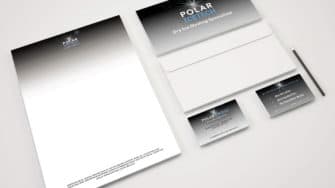
The client’s previous logo was past its sell by date, and they realised it, which is why they approached us. They wanted their new logo to encapsulate the point at which the dry ice comes into contact with the material it’s cleaning. The point is one of sublimation where literally everything is blasted clean in a moisture-free, non-abrasive, non-conductive, non-toxic, eco-friendly way.
To represent the sublimation we designed a star burst on a black background. It was a simple but effective means of explaining the cryogenic process. The whiteness of the star burst signified the cleanliness of the outcome and efficiency of the process, in stark contrast with the blackness of the background which signified the general dirt and pre-existing state of the machinery being cleaned.


